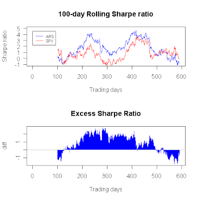
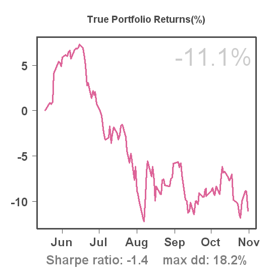
Many traders and investors prefer an equity curve as smooth as possible. It gives a sense of predictability, i.e. in our minds we extend the curve in the future and the smoother it is, the more confident we feel about our prediction. In many cases the Sharpe ratio is capable of summarizing the smoothness of the curve in a simple number, and the higher its absolute value, the smoother the curve.
Now, think about the Sharpe ratio of a sine wave for a moment...
Even though it's zero, we would be extremely happy to find a trading system with an equity curve represented by an exact sine wave. We would simply get into any open positions at the bottom of the wave and get out at the top, and repeat this over and over again for a huge profit.
Although this is an extreme example, it nicely shows that we might not only be interested in the smoothness of an equity curve, but also in the amount of randomness. I.e. it is possible that two systems have the same Sharpe ratios, while one system is less random than the other due to some much more subtle patterns not captured by the mean or standard deviation.
An interesting measure to quantify "randomness" in financial time series was published in the Proceedings of the National Academy of Sciences by Pincus and Kalman(*) about 3 years ago, based on a mathematical approach and formula called Approximate Entropy introduced in the early nineties by Pincus.
I won't go into all the details of this measure except for noting that it is rooted in the concept of information entropy developed by Shannon in 1948 as part of information theory (Wikipedia is a good first start for those who want to investigate further). Outside the world of finance, it has also found its application in the medical world (e.g. irregularity of heart rate). Approximate Entropy (ApEn) is a number, and the higher it is the more irregular (random) a time series. Thus, when applying ApEn to the daily returns of a C2 system, we would prefer a lower number over a higher number. ApEn requires 2 parameters: a block or run length (usually 1 or 2) and tolerance window (usually 20% of the standard deviation). In all figures below I use a block length of 1 and 20% of the standard deviation as tolerance windows, denoted as ApEn(1, 20% SD). The daily log-returns are used as inputs.
Over the entire history of a system, I got the following figures for the systems in my portfolio:
Trend Plays #1: 1.74
Weekend Trader: 1.95
ARS: 1.77
We can also do a rolling ApEn, estimated over 100 trading days:

This figure suggests that the equity curve of Trend Plays #1 has become more irregular (random) over time.

For Weekend Trader no such trend exists. Note that around the 400th trading day, ApEn was at its lowest point, suggesting relatively high regularity. This is reflected in the steady pattern of peaks and troughs in the equity curve during the preceding 100 trading days.

Finally, for ARS, we see yet a different curve. ApEn increased gradually over the past year, somewhat similar to what happened for Trend Plays #1.
These numbers and figures don't give an immediate clue how to improve returns and they also seem to be quite close across the systems. Pincus and Kalman show an example where a strong increase in ApEn preceded the Nov 1997 crash in the Hang Seng Index (HSI). I'll look for a C2 system that crashed and see if I can relate the crash to the system's ApEn in a future blog post.
(*) Pincus S, Kalman R E. Irregularity, volatility, risk, and financial market time series. Proceedings of the National Academy of Sciences 2004; 101(38): 13709-13714.


