Too good to be true?
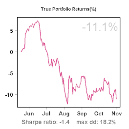
Looking at the P/L curve, Sharpe ratio and DD so far, one might wonder: Doesn't this look too good to be true?
The short answer is: Yes, definitely! Because the history is fairly short, there's not much value to these statistics yet. To understand this, the graph below might be helpful. It shows the Sharpe ratio computed for each of the past 16 trading days, given the realized return up to that date, starting with 5 days. Thus, the left-most point on the graph shows the Sharpe ratio based on the first 5 returns, the next point shows the Sharpe ratio based on the first 6 returns etc. I also estimated a 95% confidence interval for each day (using a non-parametric bootstrap with 10,000 replications). The red line shows the Sharpe ratio, the blue lines mark the upper and lower bounds of the confidence interval.
What we can see from the graph is that as more observations (days) are added in the estimation of the Sharpe ratio, the confidence intervals narrows. Still, even a small loss of 1% on day 15 has a strong effect on the Sharpe ratio itself (downwards) and confidence interval (it widens).
I'm pretty sure we will see (although infrequent) 1-day gains and losses up to 4%, and possibly more, so the current Sharpe ratio does indeed look too good to be true. Nonetheless, results so far are quite encouraging.


No comments:
Post a Comment